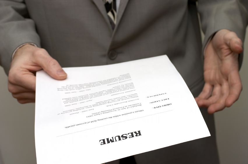
Apparently all fonts are not created equal.
Forget what you write on your CV (OK, well maybe don’t forget it, but…), because apparently your font says as much about you as your experience.
And shockingly Times New Roman – ye old faithful – is a bad move.
In fact Brian Hoff, creative director of Brian Hoff Design, told Bloomberg: ‘It’s telegraphing that you didn’t put any thought into the typeface that you selected,’ and went on, ‘It’s like putting on sweatpants.’
Other classic fonts including Courier and Comic Sans also got a beating (although apparently, according to a source in the Metro.co.uk office, Comic Sans is the ironic font of choice for hipsters. Of course it is).
So if Times New Roman is questionable, and Courier and Comic Sans are a no-nos, what font should we all be using?
Well according to the experts it’s all about Helvetica.
Brian Hoff explained: ‘Helvetica is so no-fuss, it doesn’t really lean in one direction or another. It feels professional, lighthearted, honest,’ – which seems a lot to read into a font to us, but who are we to argue?
If you really want to go all out though, apparently you should opt for a font called Proxima Nova (which sounds like a form of antibiotic to us).
You’ll REALLY want to get the job though, as Proxima Nova is a paid-for font and costs up to $734 (approximately £477) for all 144 variations (although you can get just one for around $29.99, but still, why would you when there are like a trizillion fonts for free?).
So there you have it, time to give your CV a Helvetica makeover.
Fuente: metro.co.uk